Introduction
Proceeding our dive into the PnP reusable property pane controls, I want to cover the PropertyFieldOrder control.
The PnP reusable property pane controls is a package that contains a lot of useful controls that can be used in any SharePoint Framework web part’s property pane, if you want to know more about this you can check out the official site here.
To demonstrate the various capabilities of the control, I’ve created a sample solution which you can find here. The sample solution contains a simple web part that shows how the PropertyFieldOrder works.
In few words, the control allows the user to choose the order of a predefined list of entries.
Visual appearance
Starting from how the component appears, I’ve created a sample web part which simply displays the entries used in the PropertyFieldOrder control. To make this sample a little more appealing I’ve imagined a racing with six participants:
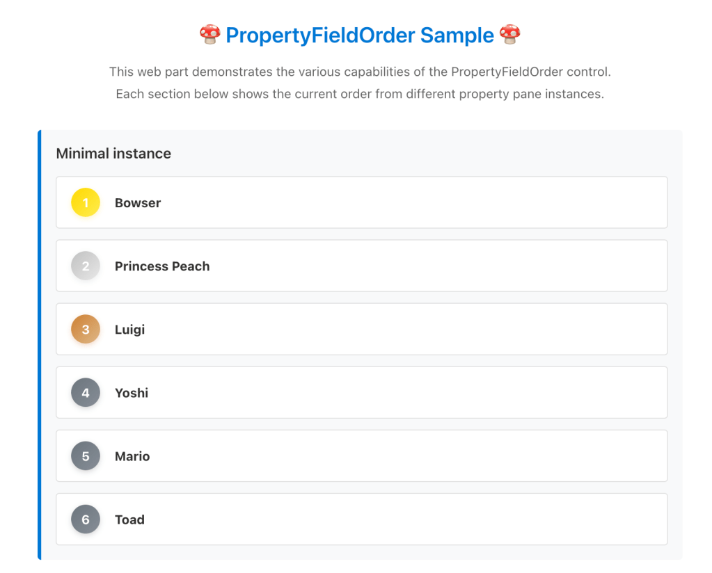
The PropertyFieldOrder control is used in the property pane, so let’s see how this is rendered:
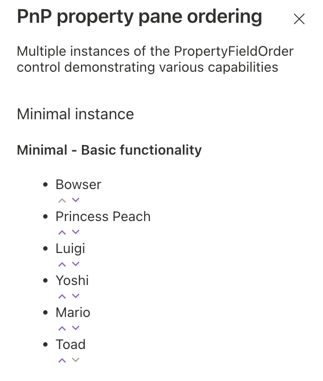
As usual, in the sample solution, you can find multiple instances of the control, each instance demonstrate a specific property of the control.
The PropertyFieldOrder control allows to reorder a list of items so here, for example, if Princess Peach throws a tortoise to Bowser, the rank can change to the following (Bowser lose two positions):
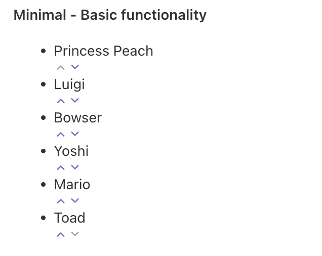
This is possible either by:
- Clicking on the up and down arrows.
- Dragging and dropping the item to the desired position.
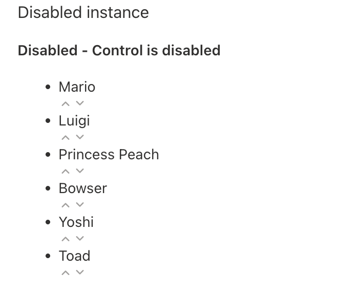
Proceeding with other control instances, it’s possible to disable the control. As a result all the arrows and the drag and drop capabilities are disabled.
The control offers the ability to modify the user experience, for example you can hide the up and down arrows, leaving only the ability to drag and drop the items:
In opposition with the previous instance, it’s also possible to disable the drag and drop capability, leaving only the ability to use the arrows to move the items around:
The next instance, is used to highlight the ability to specify a custom Fluent UI icon to be shown instead of the arrows. By default the ChevronUpSmall and ChevronDownSmall icons are used:
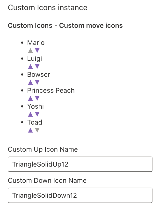
If you change the icon names, for example to TriangleSolidUp12 and TriangleSolidDown12 you can have a rendering like the following:
Finally, the last instance present in the sample solution, is the one demonstrating how to perform a custom rendering of each item:
Now, after having an idea of the possibilities, let’s cover more in detail the code used.
Show me the code
Prerequisites
To use the PnP property controls first you need to install the package:
npm install @pnp/spfx-property-controls --save --save-exact
After the installation of the package you can proceed with the following explanations for the PropertyFieldOrder control.
To use the control you have to import it in the web part file with the following statement:
import { PropertyFieldOrder} from '@pnp/spfx-property-controls/lib/PropertyFieldOrder';
Now, that we have the SharePoint Framework solution ready, let’s cover each single control instance in more detail.
Minimal instance
The minimal instance of the control shows what is the minimum configuration needed to use the PropertyFieldOrder. Each of the following instances will have the same set of basic properties plus the instance specific ones.
PropertyFieldOrder('minimalOrder', { key: 'minimalOrderFieldId', label: strings.MinimalOrderLabel, items: this.properties.minimalOrder, textProperty: 'text', properties: this.properties, onPropertyChange: this.onPropertyPaneFieldChanged})
In this minimal configuration, I think the two most interesting properties are:
items: which contains the array of items to be shown in the control.textProperty: which contains the name of the object’s property that contains the text to be displayed.
The other properties are pretty self explanatory, but for the sake of completeness here is a brief explanation:
key: is the identifier of the control instance.label: is the text shown for the control.properties: is a binding to the web part properties.onPropertyChange: is a binding to theonPropertyPaneFieldChangedmethod.
Disabled instance
In case you need to disable the control that’s easily done using the disabled property specifying a boolean value:
PropertyFieldOrder('disabledOrder', { key: 'disabledOrderFieldId', label: strings.DisabledOrderLabel, items: this.properties.disabledOrder, textProperty: 'text', disabled: true, properties: this.properties, onPropertyChange: this.onPropertyPaneFieldChanged})
Setting the disabled property to true will disable the control, setting it to false will enable the control.
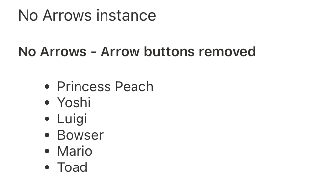
No arrows instance
Removing the arrows from the user interface might be useful and that’s possible by setting the removeArrows property to true.
PropertyFieldOrder('noArrowsOrder', { key: 'noArrowsOrderFieldId', label: strings.NoArrowsOrderLabel, items: this.properties.noArrowsOrder, textProperty: 'text', removeArrows: true, properties: this.properties, onPropertyChange: this.onPropertyPaneFieldChanged})
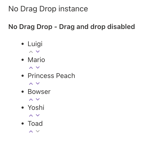
No drag and drop instance
In case you find the arrows a nice UI addition but you don’t want to allow users to drag and drop the items around, you can disable this by setting the disableDragAndDrop to true.
PropertyFieldOrder('noDragDropOrder', { key: 'noDragDropOrderFieldId', label: strings.NoDragDropOrderLabel, items: this.properties.noDragDropOrder, textProperty: 'text', disableDragAndDrop: true, properties: this.properties, onPropertyChange: this.onPropertyPaneFieldChanged})
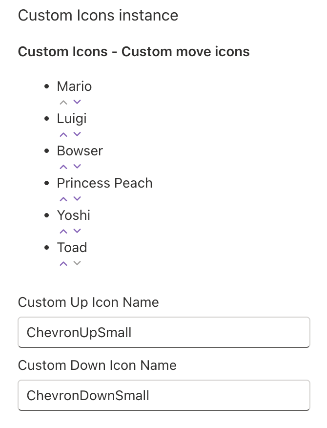
Custom icons instance
This instance demonstrates how to change the default icon for the arrows. The custom icons can be chosen from the Fluent UI ones. In the sample, there are a couple of text boxes to allow users to specify which icon to use for either the two icons.
The properties to specify the custom icons are:
moveUpIconName: the Fluent UI icon name to be used as the up arrow.moveDownIconName: the Fluent UI icon name to be used for the down arrow.
PropertyFieldOrder('customIconsOrder', { key: 'customIconsOrderFieldId', label: strings.CustomIconsOrderLabel, items: this.properties.customIconsOrder, textProperty: 'text', moveUpIconName: this.properties.customUpIcon, moveDownIconName: this.properties.customDownIcon, properties: this.properties, onPropertyChange: this.onPropertyPaneFieldChanged})
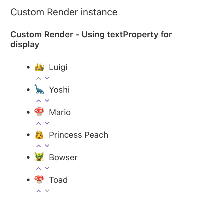
Custom render instance
The last instance present in the sample solution is the one allowing to customize the rendering of the items.
In the sample, there is the following array of items:
const defaultMarioCharacters = [ {"text": "Mario", "icon": "🍄"}, {"text": "Luigi", "icon": "👑"}, {"text": "Princess Peach", "icon": "👸"}, {"text": "Bowser", "icon": "🐲"}, {"text": "Yoshi", "icon": "🦕"}, {"text": "Toad", "icon": "🍄"}];
For each item, there are a text and an icon properties. Say that we want to display the icon near the text inside of the PropertyFieldOrder control, that is possible by setting the property onRenderItem:
PropertyFieldOrder('customRenderOrder', { key: 'customeRenderOrderFieldId', label: strings.CustomRenderLabel, items: this.properties.customRenderOrder, onRenderItem: this.renderMarioCharacter, properties: this.properties, onPropertyChange: this.onPropertyPaneFieldChanged,})
In the sample, the method used for rendering the items is the following one.
private renderMarioCharacter = ( item: { text: string, icon: string }, index: number): JSX.Element => { return React.createElement('span', { style: { display: 'flex', alignItems: 'center' } }, React.createElement('span', { style: { marginRight: '8px', fontSize: '16px' } }, item.icon), item.text );}
The method will simply create a span element and putting the icon inside another span element, alongside the text of the item.
Conclusions
The PropertyFieldOrder control is an awesome ready to use and customisable control. With this you can quickly allow users to order items without having to develop all the necessary code yourself.
If you’re interested in knowing more, you can check out the official documentation here.
Hope this helps!

 I am GuidoZam