Introduction
Proceeding with the appointments with the PnP React controls today I want to talk about the FilePicker control.
The FilePicker control is a powerful and versatile component that allows users to browse and select files from various sources within your SharePoint Framework solutions. Whether you need to let users pick files from SharePoint document libraries, OneDrive, recent files, or even upload new files, the FilePicker control has you covered.
If you’re interested you can find the code of this sample here.
Visual appearance
Let’s start with the visual appearance of the sample solution.
The FilePicker control provides a clean and intuitive interface for file selection, starting from a simple button like the following one:
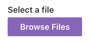
That, once clicked, opens a panel where it’s possible to select the file(s) to be selected.
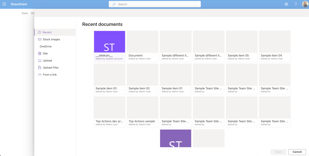
When you click the button to open the file picker, a panel opens displaying multiple tabs that represent different possible file sources:
– Recent: Displays recently modified files based on search results.
– Stock Images: Access to stock image libraries.
– OneDrive: Select files from the user’s OneDrive.
– Site: Select content from the current site.
– Upload: Upload a single file from your local drive.
– Upload Files: Upload multiple files at once.
– From a Link: Paste a link to a file.
The control also includes breadcrumb navigation for easy folder traversal and implements paged data loading to ensure optimal performance even with large document libraries.
Minimal sample
The minimal configuration sample just demonstrates the very basic configuration of the control.
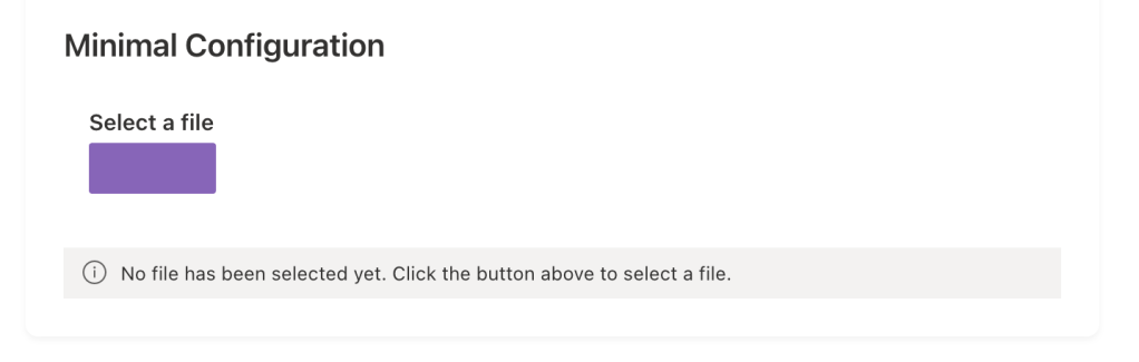
Aside of the grey area underneath the control, which is just used to list the selected file(s), the control renders a label and a button which are customisable.
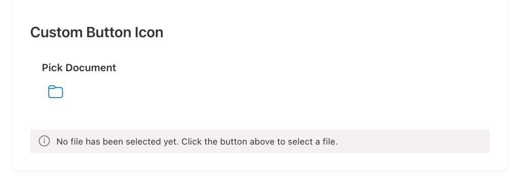
Custom button icon
This sample highlights the ability to change the button into a custom icon.
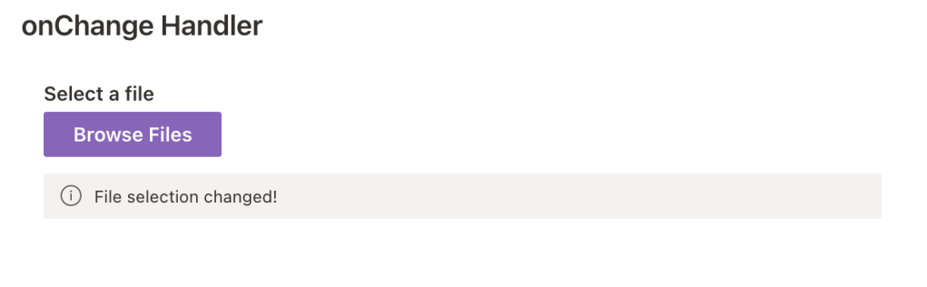
onChange handler
The onChange sample demonstrate how to use the corresponding property in order to catch when the selection change.
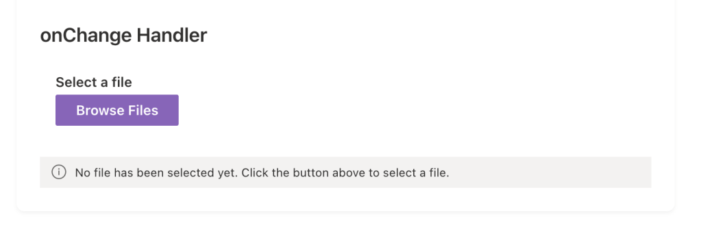
In this sample, the onChange event just triggers a message bar and also a new row in the console logging to track the change event:
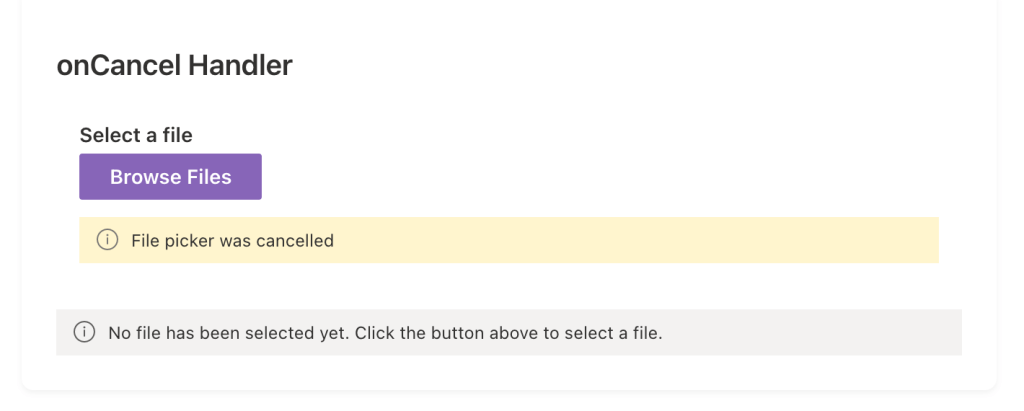
onCancel handler
The onCancel sample shows how to use the event in order to track when the panel is cancelled.
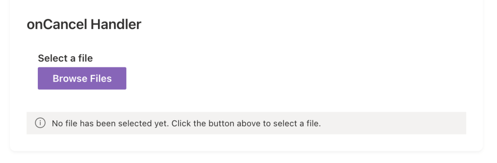
As the previous sample, this one shows a message bar when the panel is cancelled alongside a new row in the browser’s console.
File type restrictions
This sample demonstrates how to restrict the selectable files.
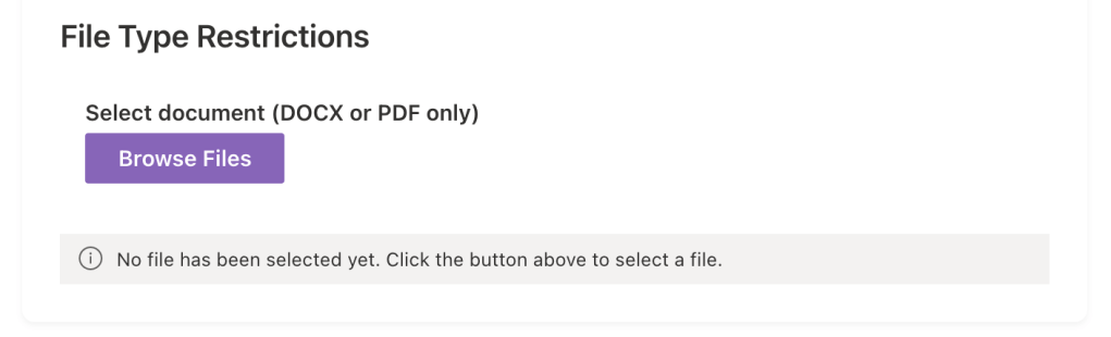
This simply doesn’t show anything special, but when the panel opens it will allow the selection of only DOCX or PDF files, this is totally customisable and I will cover that in the code section.
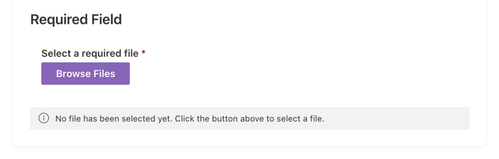
Required field
As many of the components offered by the PnP reusable React controls, it’s also possible to specify that the control is a required one:
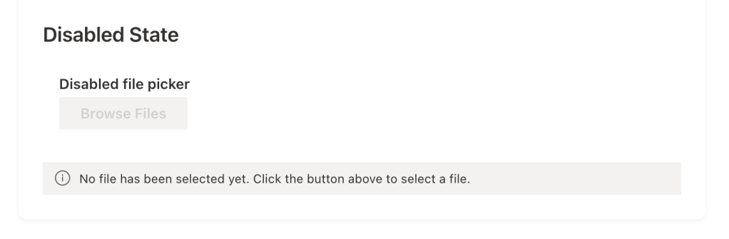
Disabled state
When needed, it’s possible to disable the control:
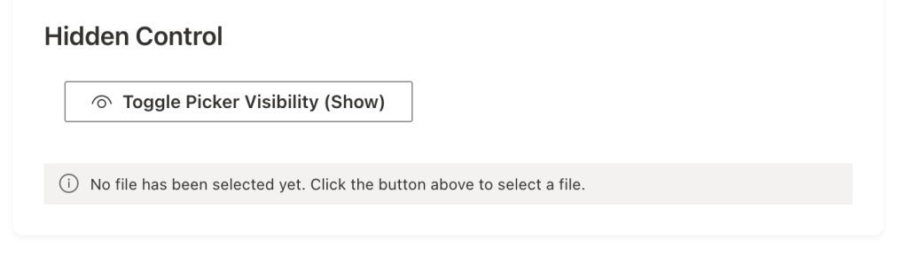
Hidden control
It’s also possible to not display the default button and trigger the panel from a hidden control. In this sample I’ve used another button to toggle the visibility of the panel:
Tab visibility control
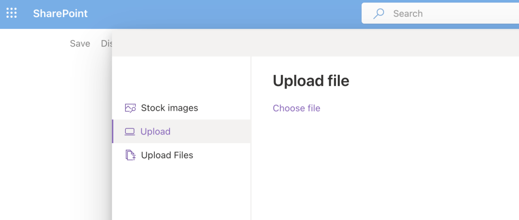
This particular instance shows how it’s possible to select which tab to show or hide from the panel, for example if you choose the following:
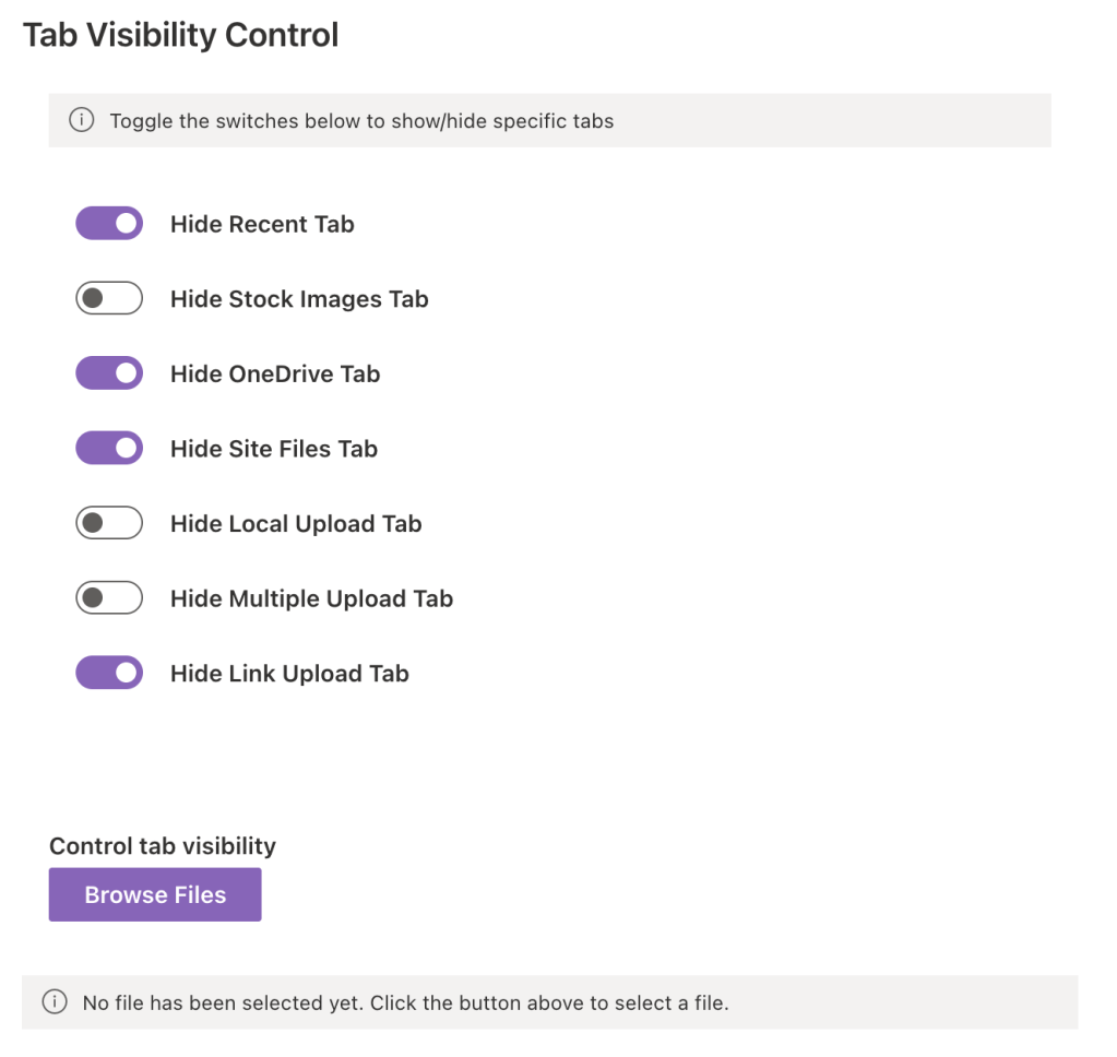
The resulting panel will be the following:
Show me the code
Prerequisites
To use the PnP React controls, first you need to install the package:
npm install @pnp/spfx-controls-react --save --save-exact
After the installation of the package you can proceed with the following instructions to use the FilePicker control.
To use the control you first need to import it:
import { FilePicker, IFilePickerResult } from '@pnp/spfx-controls-react/lib/FilePicker';
Actual implementation
In this sample solution, I’ve created multiple instances of the control to demonstrate different configurations and use cases of the FilePicker control. Let’s explore each one!
Minimal Configuration
The most basic implementation requires only two properties:
<FilePicker label="Select a file" onSave={(files) => this.setState({ selectedFile: files?.[0] })} context={this.props.context as any}/>
Key properties:
onSave: Handler called when a file is selected and saved.context: The web part context.
The label property is not really required, but without specifying it there won’t be any text displayed.
This minimal configuration gives you a fully functional file picker with all tabs enabled by default.
Custom Button Icon
Instead of a standard button, you can display an icon button using the buttonIcon property. You can further customize the icon appearance with buttonIconProps:
<FilePicker label="Pick Document" buttonIcon="FabricFolder" buttonIconProps={{ iconName: 'FabricFolder', styles: { root: { fontSize: 20, color: '#0078d4' } } }} onSave={(files) => this.setState({ selectedFile: files?.[0] })} context={this.props.context as any}/>
Key properties:
buttonIcon: Specifies which Fluent UI icon to display.buttonIconProps: Additional properties for customizing the icon (size, color, etc.).
onChange handler
The onChange handler is triggered whenever the file selection changes in the picker panel, even before the user clicks save. This is useful for real-time validation or preview.
<FilePicker label="Select a file" buttonLabel="Browse Files" onSave={(files) => this.setState({ selectedFile: files?.[0] })} onChange={(files) => { console.log('File selection changed:', files); this.setState({ selectionChanged: true }); }} context={this.props.context as any}/>
onCancel handler
The onCancel handler is called when the user closes the FilePicker panel.
<FilePicker label="Select a file" buttonLabel="Browse Files" onSave={(files) => this.setState({ selectedFile: files?.[0] })} onCancel={() => { console.log('File picker cancelled'); this.setState({ cancelled: true }); }} context={this.props.context as any}/>
File Type Restrictions
Use the accepts property to restrict file selection to specific file types. This example only allows DOCX and PDF files.
<FilePicker label="Select document (DOCX or PDF only)" buttonLabel="Browse Files" accepts={['.docx', '.pdf']} onSave={(files) => this.setState({ selectedFile: files?.[0] })} context={this.props.context as any}/>
The accepts property support an array of string representing the extensions to be supported.
Required
The required property adds a visual indication that file selection is mandatory.
<FilePicker label="Select a required file" buttonLabel="Browse Files" required={true} onSave={(files) => this.setState({ selectedFile: files?.[0] })} context={this.props.context as any}/>
The required property is a boolean flag that adds an asterisk (*) to the label. This is particularly useful in forms where file upload is mandatory.
Disabled
The disabled property prevents user interaction with the FilePicker.
<FilePicker label="Disabled file picker" buttonLabel="Browse Files" disabled={true} onSave={(files) => this.setState({ selectedFile: files?.[0] })} context={this.props.context as any}/>
This is useful if you need to conditionally disable the picker based on form state, user permissions, or other business logic.
Hidden Control with Programmatic Panel Control
The hidden property hides the picker button while still allowing you to control the panel visibility programmatically using isPanelOpen.
In the sample solution, there is a button to handle the state change:
<DefaultButton text="Toggle Picker Visibility" onClick={() => this.setState({ panelOpen: !this.state.panelOpen })}/>
And then, there is the control that displays the panel only when the previous button is clicked:
<FilePicker label="Hidden file picker (controlled programmatically)" buttonLabel="Browse Files" hidden={true} isPanelOpen={this.state.panelOpen} onSave={(files) => { this.setState({ selectedFile: files?.[0], panelOpen: false }); }} onCancel={() => this.setState({ panelOpen: false })} context={this.props.context as any}/>
Tab visibility
The FilePicker control allows many customisation, there are a bunch of properties to personalize the available tabs in the panel that allows selection of files.
Following a list of the available tab visibility properties:
hideRecentTab: handle visibility of the RecentTab.hideWebSearchTab: handle visibility of the WebSearchTab.hideStockImages: handle visibility of the StockimagesTab.hideOrganisationalAssetTab: handle visibility of the OrganisationalAssetTab.hideOneDriveTab: handle visibility of the OneDriveTab.hideSiteFilesTab: handle visibility of the SiteFilesTab.hideLocalUploadTab: handle visibility of the LocalUploadTab.hideLocalMultipleUploadTab: handle visibility of the LocalMultipleUploadTab.hideLinkUploadTab: handle visibility of the LinkUploadTab.
Conclusions
The FilePicker control is an incredibly powerful and flexible solution for file selection scenarios in SharePoint Framework applications.
Whether you need a simple file picker or a complex file selection workflow with custom validation and UI, the FilePicker control provides all the tools you need. The comprehensive feature set, combined with minimal required code, makes it an essential component for any SharePoint Framework developer working with files.
By leveraging the different configuration options shown in these examples, you can create exactly the file selection experience your users need, while maintaining clean, maintainable code through proper localization and separation of concerns.
In this blog post I didn’t cover all the available properties, if you’re interested in knowing more you can find the official documentation here.
Hope this helps!

 I am GuidoZam
One response to “Use the FilePicker from the PnP reusable React controls”
[…] Use the FilePicker from the PnP reusable React controls […]
LikeLike