Introduction
The beta release of SharePoint Framework version 1.24 introduces the support of a new SPFx solution component: the Copilot Component.
SPFx beta version has some known issues that will be fixed in the future releases.
This new component type allows the creation of SharePoint Copilot apps, these apps let developers embed interactive experiences directly within the Microsoft 365 Copilot interface, enabling users to take action without leaving the conversation.
Built with the SharePoint Framework (SPFx) and the MCP Apps model, they are automatically hosted in your Microsoft 365 tenant, eliminating hosting and routing complexity so developers can focus on creating the user experience and defining app metadata.
SharePoint Copilot app is in public preview at the time of writing, some things may change in the future.
Before starting, a couple of useful feature that we will be using and that are offered by SPFx version 1.24:
- Copilot Workbench: a local workbench to test our new Copilot integration.
- No Copilot license required to build: during the public preview window, you can create and test your SharePoint Copilot app without needing a Copilot license.
Let’s begin
Prerequisites
To create your first SharePoint Copilot app you will first have to install the toolchain, I suggest to install it locally instead of globally (since this is a beta version) and to do that you can use the following commands:
npm init -ynpm install yonpm install @rushstack/heftnpm install @microsoft/generator-sharepoint@next
If you are ok with it and want to install everything globally go with the following:
npm install -g yonpm install -g @rushstack/heftnpm install -g @microsoft/generator-sharepoint@next
Create solution
In this blog post I will demonstrate how to create the solution using the Yeoman generator.
If you want to have a look at the sample solution, you can find it here.
The command to start the wizard for the Yeoman generator is:
yo @microsoft/sharepoint@next
or the following if you installed it locally:
npx yo @microsoft/sharepoint@next
Following, you can see what are the values I used to create the sample for this blog post.
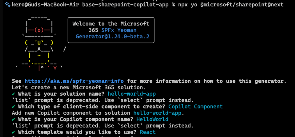
Here, what I want to highlight, is that for the type of component to create, there is a new option named Copilot Component.
Solution structure
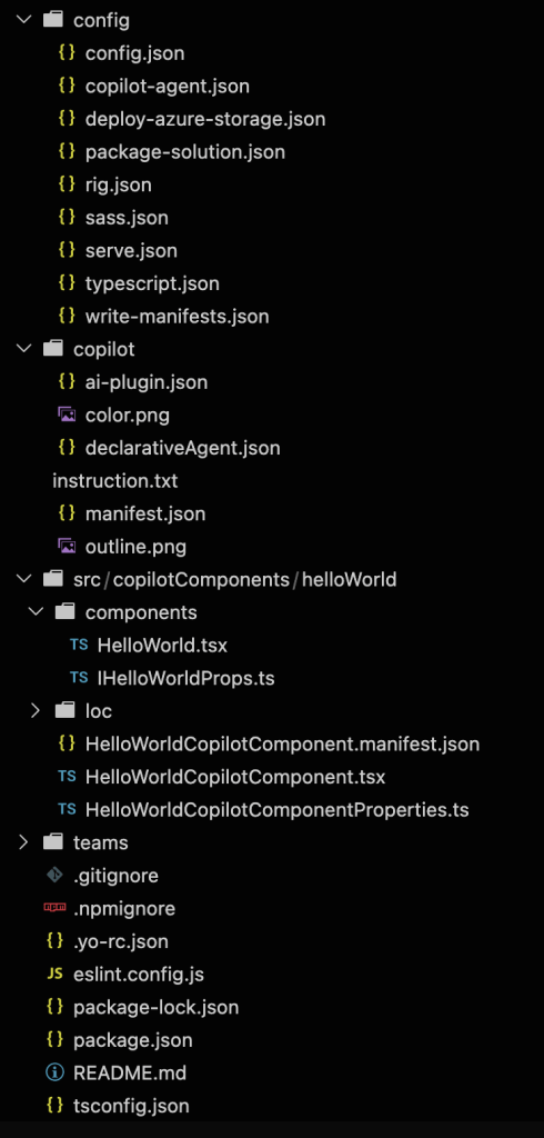
The generated solution will be like any other SharePoint Framework solution, except for some files and a folder, let’s cover those shortly.
Here is a screenshot of the solution as reference:
copilot-agent.json
inside the config folder, where you can find the SPFx build configuration, there is a new file named copilot-agent.json, this file declares the agent and the components GUIDs that the agent can use inside the current solution.
To give you an idea of the file structure:
{ "$schema": "../node_modules/@microsoft/spfx-heft-plugins/lib-commonjs/plugins/copilotAgentPlugin/copilot-agent.schema.json", "agents": [ { "name": { "default": "<Name of the agent here>" }, "description": { "default": "<Description of the agent here>" }, "components": [ "<GUID of your component here>" ] } ]}
copilot folder
This folder contains the files used to create the package for the agent to be deployed and consists of the following files:
ai-plugin.json: the API plugin manifest file that declares the functions (or if you prefer, the tools) the agent can use alongside their parameters and descriptions.declarativeAgent.json: the agent manifest. This defines the declarative agent itself, including its display name, description, the system prompt (the actual instructions of the agent), the conversation starters, and the capabilities and actions.- By default this file specify the file where the instructions of the agent are stored. The file referenced here is the
instruction.txtone, inside that file it’s specified the system prompt. - One other file that is referenced here is the
ai-plugin.jsonfile for the actions (tools) the agent can invoke.
- By default this file specify the file where the instructions of the agent are stored. The file referenced here is the
instruction.txt: the system prompt for the declarative agent.manifest.json: the Microsoft 365 app manifest. It describes the app metadata such as id, file, description, and others. This file allow to define the declarative agent though the propertycopilotAgents.declarativeAgentssection.- By default, the value of the property
copilotAgents.declarativeAgents, points to thedeclarativeAgent.jsonfile.
- By default, the value of the property
color.png: is the full coloured icon to be shown in the store, this is specified in themanifest.json.outline.png: is the monochrome outline icon, this is also used by themanifest.jsonfile.
Copilot Component
The Copilot component is the user interface displayed inside Microsoft 365 Copilot. Unlike a traditional SPFx web part, it inherits from BaseCopilotComponent, which allows it to run within the Copilot canvas and also offer some properties and methods.
Some of the functionalities exposed by the BaseCopilotComponent are:
hostContext: offers a snapshot of the hosting context, for example it can expose the followings:theme: color theme used, can belightordark.displayMode: eitherinlineorfullscreen.availableDisplayModes: an array with the display modes supported.containerDimensions: the actual height and width alongside the max values for each dimension.platform: can be one of the followings:webdesktopmobile
deviceCapabilities: declares if the device supports touch input or hover interaction.
context.copilotBridge: allows active call interaction with the Copilot host eg. opening external link.requestDisplayModeAsync: request the Copilot host to switch the component’s display mode. Remember to always check the result of the request as the host may deny the operation. Available values areinlineorfullscreen.
One last thing that is noteworthy is the handling of the parameters from the declarative agent. If you need to accept parameters that comes from the Copilot integration, you can do it by specifying the parameters as properties of the custom component.
In the default template, if you open the <name of the component>Properties.ts file, you will find something like the following:
import { z } from 'zod';import zodToJsonSchema from 'zod-to-json-schema';const propertiesSchema = z.object({ message: z.string().describe('A message to display.')});export type IHelloWorldCopilotComponentProperties = z.infer<typeof propertiesSchema>;export default zodToJsonSchema(propertiesSchema);
This is used to define a parameter named message and instruct the agent, using the description method (offered by Zod), that the value of the message parameter will be a message to be displayed. This will be treated as a parameter for the tool by the declarative agent, which will then decide autnomously what value to pass to our custom component.
Testing your solution
As said before, SPFx version 1.24 introduces a new workbench to test your Copilot integrations, but before analyzing the workbench, we need to startup our project and that is done with the command:
npm run start
Once the solution is served, you can reach the Copilot Component Workbench at the address:
https://<tenant name>.sharepoint.com/_layouts/15/CopilotWorkbench.aspx
The new workbench looks like the following:
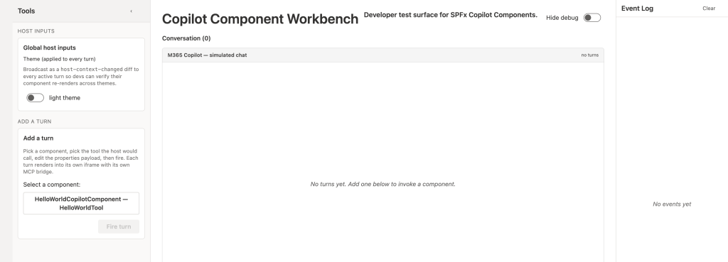
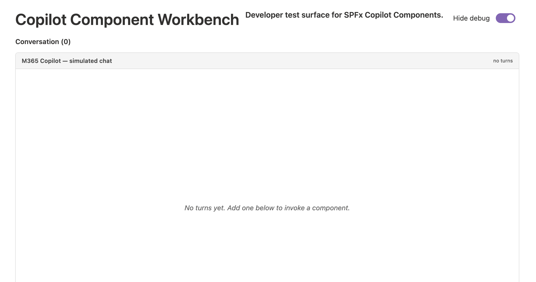
If needed, it’s also possible to hide the debug panels and only see the actual content of the Copilot simulated chat:
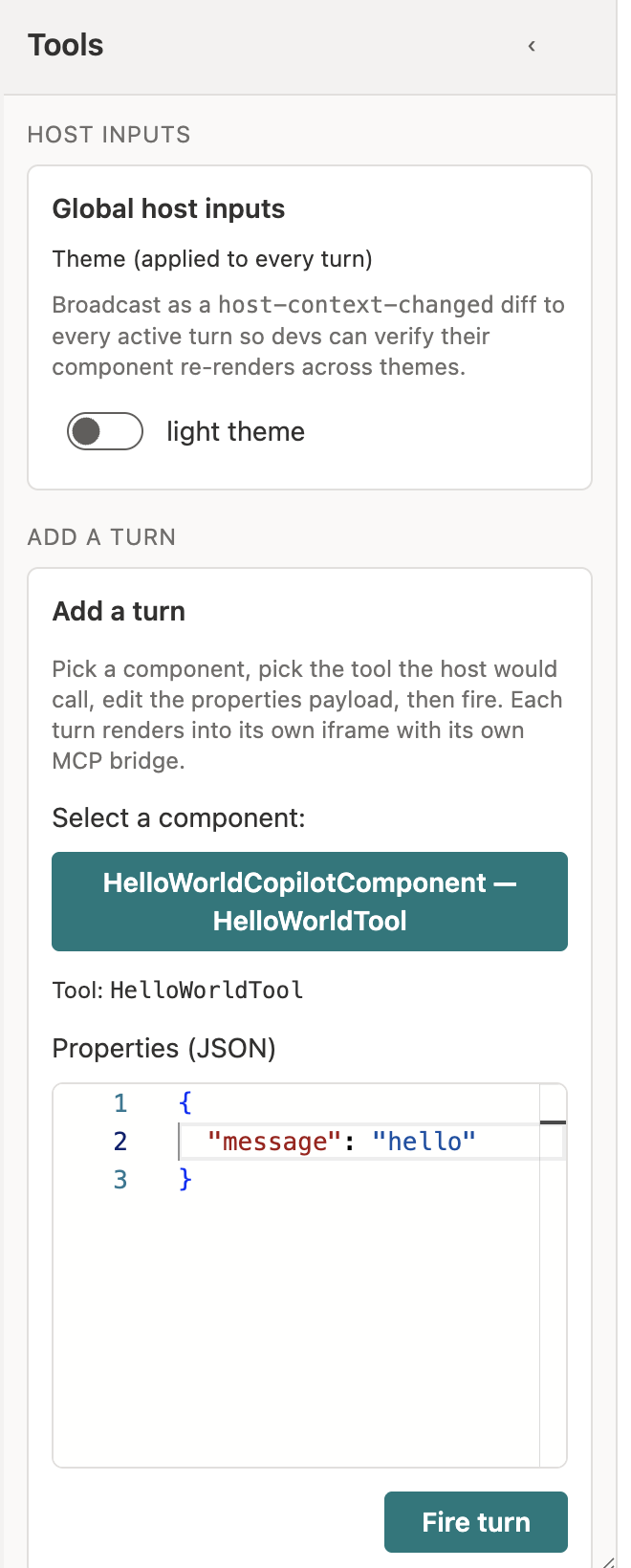
When you have the debug panels opened, you can start interacting with Copilot by triggering the first turn of your component of choice. In the following screenshot I’ve selected my HelloWorldCopilotComponent and specified that the current parameter message will simply be “hello”.
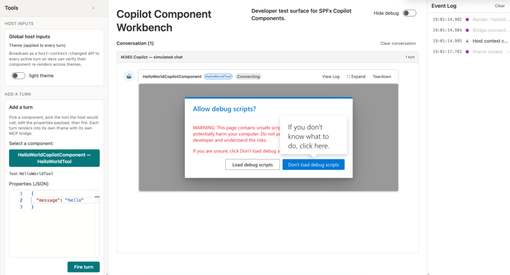
Once clicked on the Fire turn button, you will be prompted to allow debug scripts with the usual SPFx dialog we’re used to see:
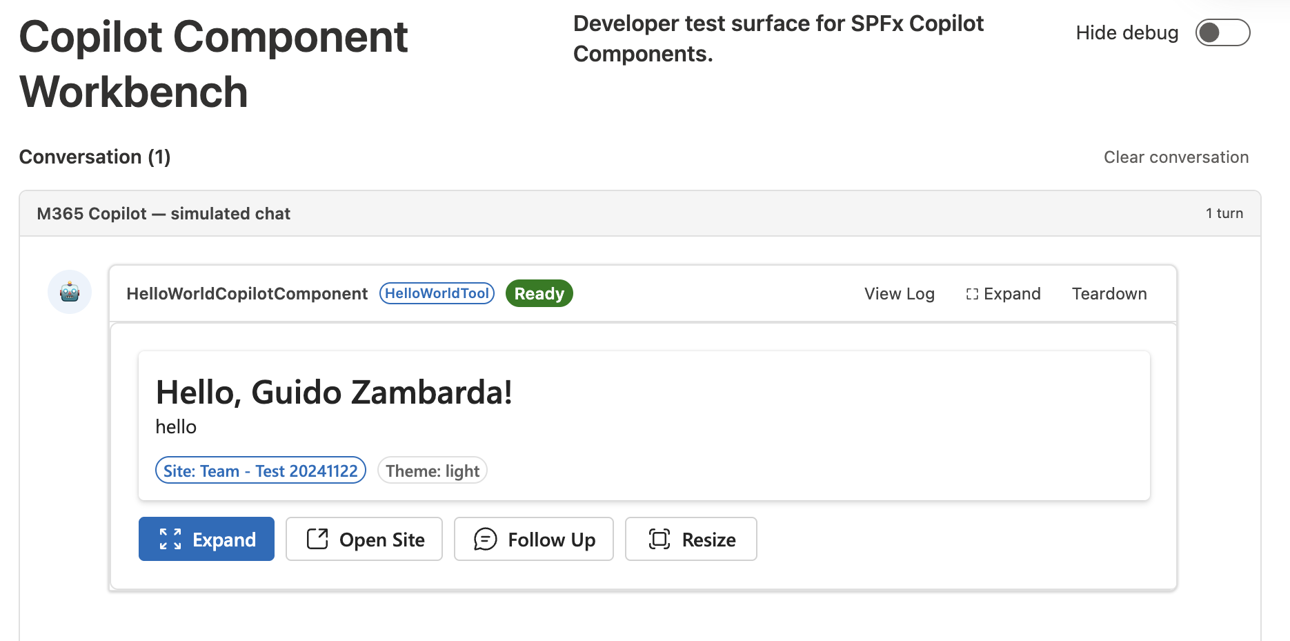
Finally, after having loaded the debug scripts, you can see your custom component in action:
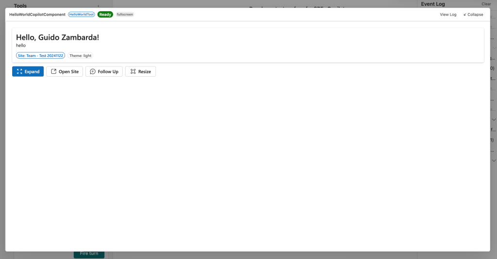
If you want, you can also display the expanded component using the Expand button:
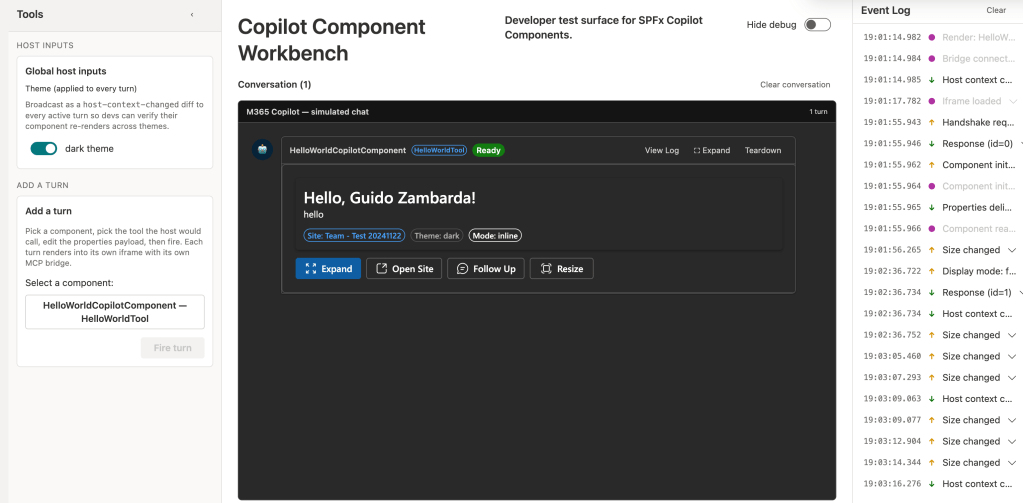
One last thing, you can also display your component with the dark theme, so you can check that everything is still usable with a different theme:
Conclusions
SharePoint Copilot apps are a very interesting evolution of the SPFx development and allows us developers (and our clients) to customize the Copilot experience and also, with some adjustments, to reuse components already created for other SPFx solutions.
If you’re interested in knowing more you can have a look at the official documentation here.
Hope this helps!

 I am GuidoZam
One response to “Create your first SharePoint Copilot app”
[…] Disclaimer: In this blog post I won’t cover the basics of creating a SharePoint Copilot app, if you’re interested in how to get started, have a look at my previous blog post here. […]
LikeLike